Complete Solutions and Summary of Introduction to Graphs – NCERT Class 8 Mathematics Chapter 13
Comprehensive explanations, examples, and exercises on graphical presentation of data, line graphs, linear graphs, coordinates, data interpretation, and applications from NCERT Class 8 Mathematics Chapter 13.
Updated: 10 months ago
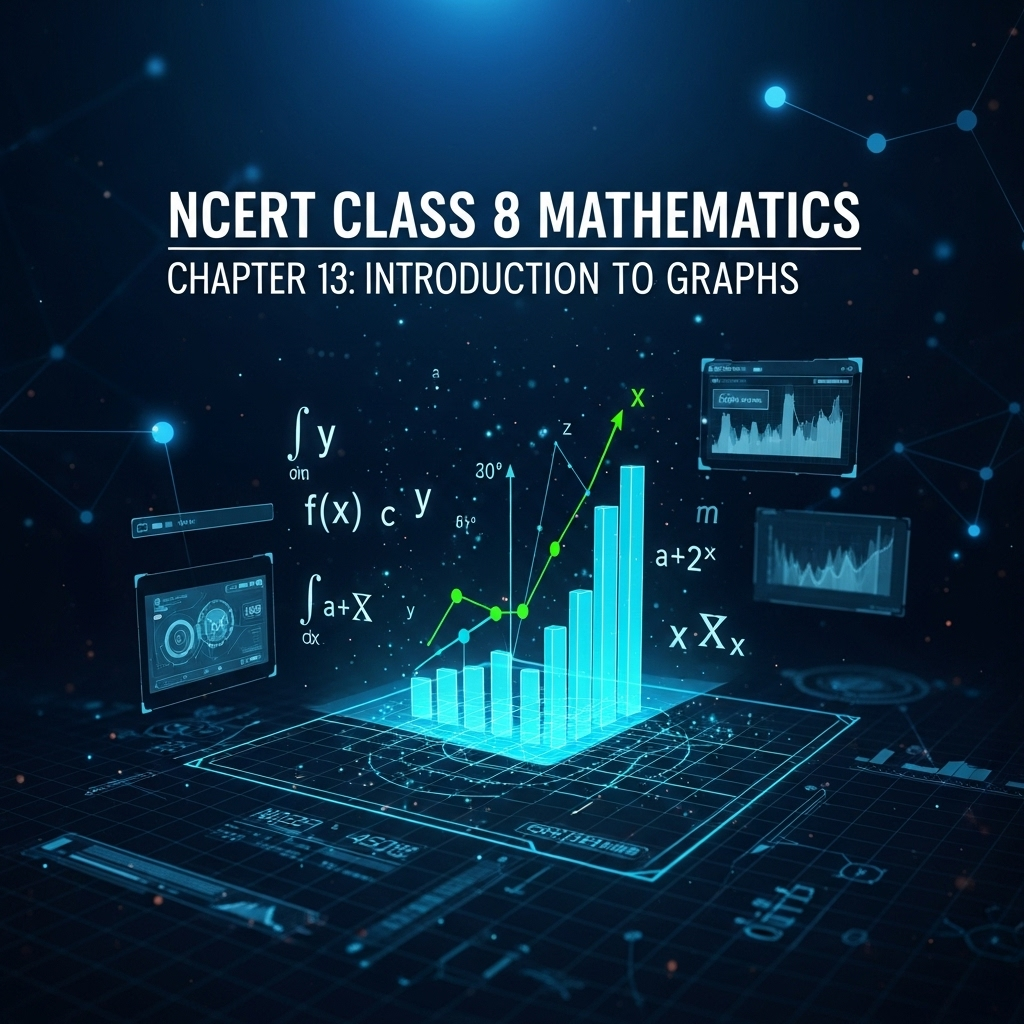
Introduction to Graphs
Chapter 13: Mathematics
Complete Study Guide with Interactive Learning
Chapter Overview
What You'll Learn
Introduction to Graphs
Understanding the purpose of graphs for visual representation of data, trends, and comparisons.
Line Graphs
Learning how line graphs show data that changes continuously over time, with examples like time-temperature graphs.
Applications
Exploring real-life applications such as quantity-cost relations and principal-interest graphs.
Linear Graphs
Identifying linear graphs in direct variation scenarios and how to plot them.
Historical Context
This chapter introduces graphs as visual tools for data representation, easier than tables for understanding trends. It covers line graphs for continuous changes, with examples from temperature records to performance analysis, emphasizing their role in everyday applications like cost and interest calculations.
Key Highlights
Graphs help in quick comprehension of numerical data. Line graphs connect points to show patterns, and linear graphs represent direct variations, passing through the origin. Applications include dependent and independent variables in scenarios like distance-time and quantity-cost.


As an Amazon Associate, ProSyllabus earns from qualifying purchases. Prices shown are subject to change.
Test your CBSE Class 8 Annual Assessment prep
Dual AI-verified questions Real exam pattern First quiz free
Class 8 Science — Exploring Forces (Practice Quiz)
Class 8 Science — Health: The Ultimate Treasure (Practice Quiz)
Class 8 Science — The Invisible Living World: Beyond Our Naked Eye (Practice Quiz)
Class 8 Maths — A Story of Numbers (Practice Quiz)
Class 8 Science — Exploring the Investigative World of Science (Practice Quiz)
Class 8 English — Wit and Wisdom (Practice Quiz)
Class 8 Hindi — स्वदेश (Practice Quiz)
Class 8 Science — Particulate Nature of Matter (Practice Quiz)
Direct and Indirect Speech Advanced Challenge | CBSE Class 8 Annual Assessment
Class 8 Hindi — तरुण के स्वप्न (Practice Quiz)
Class 8 Hindi — आदमी का अनुपात (Practice Quiz)
Class 8 Hindi — नए मेहमान (Practice Quiz)
Class 8 Hindi — मत बाँधो (Practice Quiz)
Class 8 Hindi — एक टोकरी भर मिट्टी (Practice Quiz)
Class 8 Hindi — कबीर के दोहे (Practice Quiz)
Class 8 Hindi — हरिद्वार (Practice Quiz)
Class 8 Hindi — एक आशीर्वाद (Practice Quiz)
Class 8 Hindi — दो गौरैया (Practice Quiz)
Class 8 Sanskrit — धातुरूपाणि (परिशिष्टम् ३) (Practice Quiz)
Class 8 Sanskrit — शब्दरूपाणि (परिशिष्टम् २) (Practice Quiz)
Class 8 Sanskrit — व्याकरणम् (परिशिष्टम् १) (Practice Quiz)
Class 8 Sanskrit — वर्णोच्चारण-शिक्षा १ (Practice Quiz)
Class 8 Sanskrit — सम्यग्वर्णप्रयोगेण ब्रह्मलोके महीयते (Practice Quiz)
Class 8 Sanskrit — सन्निमित्ते वरं त्यागः (ख-भागः) (Practice Quiz)
Class 8 Sanskrit — सन्निमित्ते वरं त्यागः (क-भागः) (Practice Quiz)
Class 8 Sanskrit — कोऽरुक् ? कोऽरुक् ? कोऽरुक् ? (Practice Quiz)
Class 8 Sanskrit — पश्यत कोणमैशान्यं भारतस्य मनोहरम् (Practice Quiz)
Class 8 Sanskrit — मञ्जुलमञ्जूषा सुन्दरसुरभाषा (Practice Quiz)
Class 8 Sanskrit — डिजिभारतम् — युगपरिवर्तनम् (Practice Quiz)
Class 8 Sanskrit — गीता सुगीता कर्तव्या (Practice Quiz)
Class 8 Sanskrit — प्रणम्यो देशभक्तोऽयं गोपबन्धुर्महामनाः (Practice Quiz)
Class 8 Sanskrit — सुभाषितरसं पीत्वा जीवनं सफलं कुरु (Practice Quiz)
Class 8 Sanskrit — अल्पानामपि वस्तूनां संहतिः कार्यसाधिका (Practice Quiz)
Class 8 Sanskrit — संगच्छध्वं संवदध्वम् (Practice Quiz)
Class 8 English — Science and Curiosity (Practice Quiz)
Class 8 English — Environment (Practice Quiz)
Class 8 English — Mystery and Magic (Practice Quiz)
Class 8 English — Values and Dispositions (Practice Quiz)
Class 8 Maths — Area (Practice Quiz)
Class 8 Maths — Tales by Dots and Lines (Practice Quiz)
Class 8 Maths — Algebra Play (Practice Quiz)
Class 8 Maths — Exploring Some Geometric Themes (Practice Quiz)
Class 8 Maths — Proportional Reasoning-2 (Practice Quiz)
Class 8 Maths — The Baudhayana-Pythagoras Theorem (Practice Quiz)
Class 8 Maths — Fractions in Disguise (Practice Quiz)
Class 8 Maths — Proportional Reasoning-1 (Practice Quiz)
Class 8 Maths — We Distribute, Yet Things Multiply (Practice Quiz)
Class 8 Maths — Number Play (Practice Quiz)
Class 8 Maths — Quadrilaterals (Practice Quiz)
Class 8 Maths — Power Play (Practice Quiz)
Class 8 Maths — A Square and A Cube (Practice Quiz)
Class 8 Science — Our Home: Earth, a Unique Life Sustaining Planet (Practice Quiz)
Class 8 Science — How Nature Works in Harmony (Practice Quiz)
Class 8 Science — Keeping Time with the Skies (Practice Quiz)
Class 8 Science — Light: Mirrors and Lenses (Practice Quiz)
Class 8 Science — The Amazing World of Solutes, Solvents, and Solutions (Practice Quiz)
Class 8 Science — Nature of Matter: Elements, Compounds, and Mixtures (Practice Quiz)
Class 8 Science — Pressure, Winds, Storms, and Cyclones (Practice Quiz)
Class 8 Science — Electricity: Magnetic and Heating Effects (Practice Quiz)
Geography: Resources and Development Practice Quiz | CBSE Class 8 Annual Assessment
Civics: Social and Political Life III Practice Quiz | CBSE Class 8 Annual Assessment
English (Honeydew / It So Happened) Practice Quiz | CBSE Class 8 Annual Assessment
Hindi (Vasant / Bharat Ki Khoj / Sanshipt Budhcharit) Practice Quiz | CBSE Class 8 Annual Assessment
Comparing Quantities and Percentages Practice Quiz | CBSE Class 8 Annual Assessment
The Indian Constitution Fundamentals | CBSE Class 8 Annual Assessment
Crop Production and Management Fundamentals | CBSE Class 8 Annual Assessment
Rational Numbers Operations Fundamentals | CBSE Class 8 Annual Assessment

Group Discussions
No forum posts available.

